Minggu, 30 Juni 2013
Sabtu, 29 Juni 2013
Saturday Inspiration - Manuel Canovas Bengale
I am wild about pink and orange used together and my favorite example of this beautiful combination is the classic and iconic Bengale in Paprika by Manuel Canovas. Here it is in all sorts of applications big and small and all fabulous! BTW, the styling above is fantastic with the Chinese Chippendale chairs in pink ikat, the vintage lucite bar cart, the pineapple, and very good taste in Champagne.
Jumat, 28 Juni 2013
Small Abstract Art
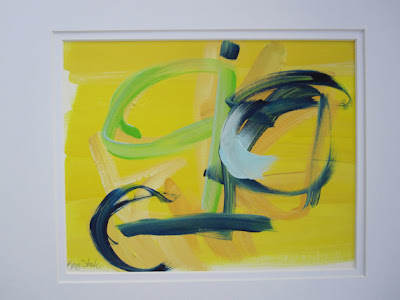
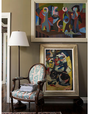
Here are more photos of the way I use small abstract art in my own home.
Kamis, 27 Juni 2013
Unexpected Combination & New Inspiration Board
 |
| Elle Decor |
 |
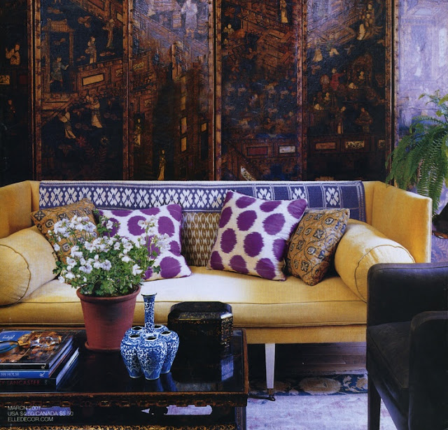
| I have used lavender walls, canary yellow Bergere club chairs from Charlotte & Ivy, purple ikat pillows from Madeline Weinrib, a blue and white Chinese garden stool, and vintage faux bamboo chandeliers painted Chinese red |
 |
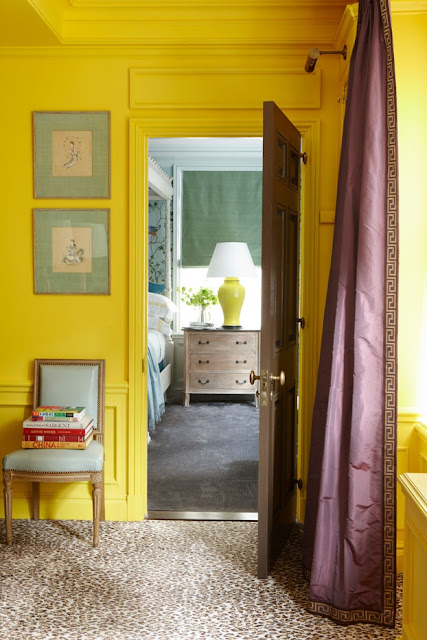
| Nick Olsen - don't miss the leopard carpet and Greek key trim on the purple curtains |
 |
| Nick Olsen |
 |
| Amanda Nisbet |
 |
| Fromental |
 |
| Kristen Buckingham |
Rabu, 26 Juni 2013
Trending - Antelope and Inspiration Board
Antelope has gotten hot, hot, hot as an alternative to leopard and zebra. Although some have dismissed it as trendy, I think it a new classic, here to stay, and I love it. The conventional wisdom is that it is best used in neutral (to me, boring) rooms where it takes center stage. No! It is far more neutral than leopard and zebra and they all work beautifully with color and with Chinoiserie.
In my inspiration board, I have paired it with Thibaut's cheetah wallpaper. Are they natural enemies? Not in this chic entryway with its gold leaf Greek key console, pagoda lamps, and gold twig mirror, all beautiful finds from Charlotte & Ivy.
I envision using the antelope as a rug in the foyer and then on the stairs as a runner. It is also wonderful as a rug or as wall to wall in a living room, dining room, hallway, or bedroom. It hides dirt very well. Sources include Stark (above), Karastan, Couristan, and Glen Eden.
Want more inspiration? - here is my Pinterest board on Antelope.
BREAKING NEWS - My Blue and White Chinoiserie Pinterest board is featured this week on Pinterest Weekly. You can follow it here.
Check out these wonderful spaces that combine antelope, color, and Chinoiserie.
Selasa, 25 Juni 2013
Joe Nye Remembered
It was with great sadness that I learned of the passing of Los Angeles interior designer Joe Nye last week. Although we never met in person, we exchanged many emails and phone calls and I cherish his book Flair that he sent me. Joe was such a gentleman, never failing to thank me if I mentioned him in a post, and quite often sending me an email to comment on a post of mine he had enjoyed. Joe did an interview with me on Chinoiserie in 2011, and I thought I would reprint my post from September 23, 2011 with that interview and some of his beautiful portfolio of work, a legacy anyone would be proud of. I have also included here some of my favorite quotes of his on interior design -
"It's 900 square feet, and I was worried about living in such a small place. But I found out it's freeing! I decided to practice the decorating philosophy that I preach to my clients: Live the way you live for 350 days a year. The other 15 are aberrations."
"If you don't have house guests, you don't need a guest room. If you don't have large sit-down dinner parties, you don't need a separate dining room. If you usually just have people over for drinks, you only need seating for six or eight."
"When I bought it. I didn't have a clue where it would go, but I had to have it."
"For me, there can never be enough vases and objects and candlesticks. But you don't have to have everything out all the time. I have cabinets filled with things, and I rotate constantly."
"That really tense juxtaposition between potentially twee wallpaper with the drama of an intense painting, with its riot of color, has this almost anti-lyrical quality to it. I like having an important piece of contemporary art against a very, very traditional handprinted English wallpaper. I have an Eero Saarinen side table next to a Frances Elkins dressing mirror."
"You need some contrast to rooms. When everything is of the same great pedigree, rooms look like museums. I didn't want my bedroom to look like Babe Paley's."
"You need some contrast to rooms. When everything is of the same great pedigree, rooms look like museums. I didn't want my bedroom to look like Babe Paley's."
My Post and Interview with Joe Nye from September 23, 2011
Los Angeles based interior designer Joe Nye is a great personal favorite of mine and the designer whose style I think is closest to my own. His own home shown first below he describes as late 1970s English decorating in 2011, heavily layered with pretty clutter. Elegant and sophisticated, his look is a great mix of modern with antiques, as in a bold piece of modern art against English wallpaper. A collector, he believes that what makes a room great is the last 10% - the accessories. You will see in his portfolio his great love of Chinoiserie. His book Flair is an absolute must for the lover of Chinoiserie.
Q - How do you use Chinoiserie?
A - TO BREAK UP THE RHYTHM OF A ROOM. A CHINOISERIE PIECE, WITH ALL OF ITS FANCIFUL DESIGNS, CAN BECOME A FOCAL POINT. I USED A WILLIAM AND MARY RED SECRETARY WITH CHINOISERIE DECORATION IN A DRESSY LIVING ROOM AND IT IS THE FIRST THING YOU NOTICE WHEN YOU ENTER THE ROOM.
Q - Why do you like to use Chinoiserie?
A - IT IS GORGEOUS!! IT IS A TIMELESS DECORATING MOTIF THAT HAS ENDURED YEARS OF DESIGN IN FURNITURE, FABRICS, SCENIC WALLPAPERS. IT IS STILL AS POPULAR TODAY AS IT WAS YEARS AND YEARS AGO.
Q - What does Chinoiserie add to a room?
A - AS SAID BEFORE, LACQUERED OR JAPANNED FURNITURE CAN BREAK UP A SEA OF BROWN FURNITURE AND AN OTHERWISE STODGY ENVIRONMENT.
Q - What are your favorite Chinoiserie pieces?
A - COFFEE TABLES, SECRETARIES, CHESTS OF DRAWERS. I ESPECIALLY LIKE SMALLER ACCESSORIES.........BOXES, LAMPS, BIBELOTS, TO GIVE CHARACTER TO A ROOM AND THEY ACT LIKE JEWELRY.

Langganan:
Komentar (Atom)


